
-
The data on this page defaults to showing you totals and trends from the last 30 days (not including today). Data is displayed on a day by day basis, but can be updated to show week or monthly groupings. Settings can be updated via the filters at the top of the page.
Any filtering will apply to both the data on this page as well as the data in the Volume Insights and Performance Details tabs.
This tab includes five key sections:
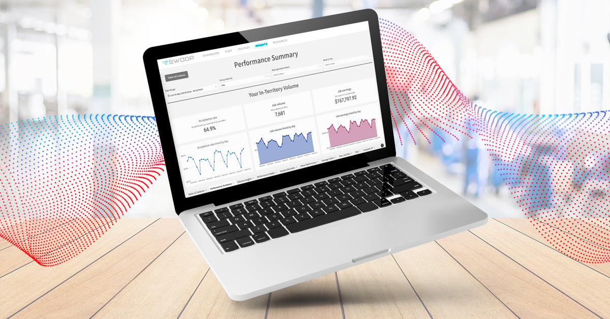
- Your "In-Territory Volume" numbers, including Acceptance Rate.
- The "Growing Your In-Territory Volume" section, which provides insight into the jobs you were offered but did not accept, as well as the other jobs in your territory that were not offered to you. You can use this information to understand if you have room to increase your acceptance rate, as well as understand the jobs you are missing out on due to competitive performance.
- The "Dispatch Success" section highlights your Completion Rate and NPS, both of which impact provider selection.
- "Key Selection Metrics Impacting Your Volume" provides a comparison between your metrics and your highest performing or lowest cost competitors in your territory. Each data point should be considered separately. This is not a comparison against a single competitor but one in each category.
- In the "Dispatch Transparency" section, you'll see how many jobs are supported with Location Based Tracking and those that had photos attached.
Note that there are instances when there is no data to show. When this is the case, your charts will look like the below (line chart will show no data, area charts will display as 0).


Here’s what you can find:
- Performance Summary: Keep your finger on the pulse of your business by tracking essential metrics like completion rate and NPS. Compare yourself with top providers in your area and identify opportunities to improve.
- Volume Insights: Understand how your performance impacts the number of jobs you receive, uncovering opportunities for growth and enabling you to make adjustments that boost your market share.
- Performance Details: Deep dive into your in-territory acceptance rate, completion rate, and NPS.
- Volume Simulator: Estimate changes in your job offer volume over the past 30 days by simulating improvements to your key performance metrics - providing you with valuable insight based on past trends.
- Cost Comparison: Gain clarity on your financials by comparing your costs to competitors, allowing you to make smarter, more informed financial decisions.
- Driver Performance & Damage Claims: Monitor individual driver performance and track any damage claims.
- Raw Job Data: Dive deeper into your insights with a table containing all job offer information, with many filters available as well as an FAQ.
These familiar metrics are located in both the Performance Summary and Performance Details tabs. Here, you'll also find a comprehensive comparison of your performance versus your competitors', helping you identify areas of opportunity.
-1-1.png?width=1080&height=519&name=Completion%20Rate%20and%20NPS%20(3)-1-1.png)
Your Acceptance Rate (accepted jobs as a percent of all job offers) can be found in the Performance Summary tab.
If you want to further evaluate your Acceptance Rate metric and all of the factors that go into it, head over to the Performance details tab to check out your Offer Acceptance stats. The Offer Acceptance section providers a deeper dive into your Acceptance Rate metric including any jobs that were not accepted and the reasons 'why,' including: Rejected %, Expired % & Agero Rejected %.

You can track jobs that went En Route and provided GPS data as a percentage of all jobs that went En Route. You can view this metric broken down by day for more detailed tracking and performance insights. Please add that this information can be located in the Performance Summary tab under the ‘Dispatch Transparency’ section, located at the bottom of the page.

The Completion Rate and NPS values displayed on the Performance Summary and Performance Details page reflect your average performance for the selected date range, based only on your in-territory, auto-assigned jobs. In contrast, the values shown on the Volume Simulator page are based on your selection metrics, which include Completion Rate and NPS across all jobs - including those accepted as out-of-territory or via manual assignment.
Additionally, the metrics in the Volume Simulator are determined by taking the average of the last 30 days performance, with each day within that tally being its own average of the last 30 (NPS) or 45 (Completion Rate) day.
Most pages of the dashboard only show in-territory, auto-assign jobs. The exceptions are the Driver Performance and Raw Job Data tabs, which show ALL of your data.
For example, if you were a provider where all of your offers and dispatches were manual assign, then you would only see that data on the above tabs.
A job offer may be marked as "Agero Rejected" if your submitted ETA did not meet our required acceptance criteria.
ETA Accuracy is based on how closely your Actual Time of Arrival (ATA) matches your provided Estimated Time of Arrival (ETA).
The formula is:
(Number of jobs where ATA is less than or equal to ETA) divided by (total jobs with both ETA and ATA recorded).
If your ATA is equal to or earlier than your provided ETA, that job improves your ETA Accuracy (and your % goes up). If your ATA is longer than your ETA, that job reduces your ETA Accuracy (and your % goes down).
If a job is missing an ATA, it is not included in the calculation.

Auto-Assign is the process we use to digitally offer jobs to our providers via the Swoop app or a third-party dispatching application. Despite the naming convention, auto-assigned jobs aren’t actually automatically assigned to you; It’s simply a digital means to offer you a job.
Manual Assign jobs, on the other hand, are offered via a phone call rather than our standard digital assignment offer system.
Each reporting tab has its own filters at the top, including a pre-set date range of the last 30 days, which you can adjust for different time periods. Many reports also let you filter by road or tow volume. Feel free to explore and customize these filters to get the exact data you need.
If you're a road-only service provider and notice a small number of "tow" job offers in your Insights report, don't be alarmed. This may happen because:
- The job was initially a tow request, but the customer switched to a road-only service.
- The job was set up as a road service with a possible tow.
These cases should be minimal. If you see a high number of job offers for services you don't provide, contact the Provider Advocate Group to review your service setup.
NPS is a measure of your customers' satisfaction with the service provided. NPS can be improved by arriving within your ETA, engaging politely with the customer as well as having a well-maintained truck and uniformed driver.
Note that we do not count NPS scores for jobs where you may be the second provider dispatched. We also use a placeholder score if your NPS survey response rate is very low.
Check out our recent blog post on NPS for more information on what NPS is, how it's calculated, what we consider a good score and why we choose to use NPS feedback as a measure of job quality.
You can also dive into the Agero Provider Handbook, particularly pages 18-22, for an in-depth exploration of our community guidelines. Here, we explain how important you are as a crucial part of our brand, highlighting that customer satisfaction/NPS is our top priority for everyone.
Your completion rate is the percentage of jobs that are successfully completed out of the number of total jobs you accept. We exclude any jobs that are canceled by us or our customers within 15 minutes of you accepting the job.
With completion rate included in Agero selection and responsible, in part, for determining your job volume, understanding how completion rate works is critical. For a comprehensive guide to improving your completion rate performance, check out this article.
If you're looking to re-negotiate your rates with us, please reach out to the Provider Advocate Group. Please note that submitting an adjustment request does not guarantee that you will receive an adjustment.
If you're looking to modify your territory and change your zip codes, please head on over to PAG. To check out your zip codes in Swoop, read this article that provides detailed instructions on where to find your business details in Swoop.
The Insights Dashboard is your go-to tool for staying on top of your Agero business performance. It’s the only place where you can access a full view of how your team is performing, ensuring you stay on track and competitive in the market. Whether you want to improve key metrics or simply keep an eye on your progress, the dashboard provides everything you need to succeed.
Anyone on your team that has "admin" status in your Swoop account should be able to access the Insights Dashboard. If that is not the case, please contact the Provider Advocate Group.
If you would like to share specific tables or charts, you can do so by hovering your mouse over your chart/table of choice until you see a small white bubble pop up in the corner of the chart. Click on the three horizontal dots, then click "export," then select the file type you'd like (CSV, excel, JPEG, etc.).
.jpg?width=658&height=418&name=Screenshot%202024-08-05%20at%201.55.13%20PM%20(1).jpg)


Video: Example Use Case
Follow along as we walk through a real example of how to use the Insights Dashboard to investigate Acceptance Rate, Rejection Rate and Completion Rate trends as well as individual Driver performance.
WATCH HEREInsights Dashboard Webinar
Tune into our Insights Dashboard webinar to discover how to make the most of this powerful tool.
WATCH HERE.gif?width=401&height=401&name=insights-hub-resource-handout-icon%20(1).gif)
Informational Handout
Download our flyer and post it in your office for a frequent reminder of what the Insights Dashboard offers and how to log in.
DOWNLOAD HERESwoop Resource Center
Review help articles on the performance metrics we use for provider selection.
TAKE ME TO SWOOPPerformance Selections GIF
For a quick visual explanation of our selection logic process, click here.
CLICK HERE